April 22, 2026
Updated on
The ultimate design system guide (Update 04/2026)
A design system is a Figma file with a few buttons and a color palette. Right?


Table of contents
Wrong. And this is precisely the problem with most guides on this topic: they explain component taxonomies and governance models as if the whole thing were an academic exercise. There is a rarely addressed gap between this theory and reality, in which senior designers spend weeks discussing two shades of gray and the development handover fails due to naming chaos.
The most common reason why design systems fail is neither a lack of components nor incorrect token structures. It's a lack of ownership, a lack of alignment between design and development and the illusion that you can build a "perfect" system before you use it.
According to the Design Systems Report 2026 by zeroheight, satisfaction with buy-in for design systems has fallen from 42% to 32% and adoption remains the biggest existential challenge for design system teams. This means that even teams that have a system are struggling to use it.
At the same time, tooling is moving on. At Schema 2025, Figma introduced Slots - a new way to make components easier to customize while reducing maintenance for design systems. The feature has been in open beta since March 5, 2026. We discuss what slots mean for your workflow and why the feature represents a real turning point in the section on the building blocks of a design system.
What is a design system?
The name is often misleading. Not only because "design" encompasses much more than the visual. But also because there is far more to a design system than "just" design.
A design system is the common denominator that product teams use as a visual, technical and editorial guide when designing digital products. It provides clear rules and reusable elements that enable teams to work more efficiently and create a more consistent user experience. Principles, language, code, design tokens and systematic documentation are just as much a part of it as the obvious buttons and color palettes.
In short, a design system is a living system that functions as a toolbox and knowledge repository and evolves with the requirements of the company.
What is the difference between a style guide, pattern library & design system? This table brings clarity:
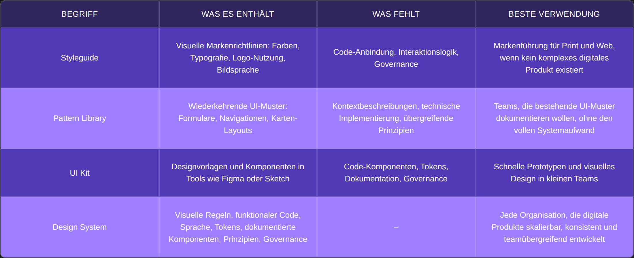
A style guide shows how something should look. A pattern library shows how it can be built. A design system shows how everything works together.
The historical arc: From Bootstrap to Slots
The roots go back to analog brand communication. In the 2000s, style guides went digital as websites became more complex. Pattern libraries emerged in the 2010s, fueled by frameworks such as Bootstrap and Brad Frost's Atomic Design principle.
The next step was taken by companies that systematically dovetailed design, code and documentation. Material Design from Google or Salesforce Lightning are considered role models. Then came design tokens as a bridge between design tools and code. Variable modes in Figma enabled multi-theme and multi-brand setups. And since March 2026, Figma Slots mark the next evolutionary step: placeholder containers in components that allow instances to be added, edited and customized without having to detach them, offering more flexibility in design while maintaining consistency with code.
Design systems are no longer a luxury reserved only for Google and Microsoft. But they are also not a mandatory program for every startup with three designers. We explain when a system makes sense in the section on decision support.
The building blocks of a design system
A professional design system not only defines how something looks, but also why it is designed the way it is, how it is implemented and how it is used correctly by everyone involved. Don't be put off by the abundance: It can be a much leaner option for SMEs.
Design principles and guidelines
Before colors are chosen or components are built, a design system needs a strategic foundation. Design principles answer questions such as: What is more important to us - clarity or personality? Speed or depth of detail? Flexibility or consistency? They help teams to make the right decisions in the event of conflicts, regardless of discipline or platform.
In addition to principles, UI-specific guidelines also play a role: when which component is used, which states are mandatory, how elements behave responsively.
Practical tip: Formulate principles as real decision-making aids. "Clarity before cleverness" is useful. "We design user-friendly" is not.
Visual language: color, typography, icons
The visual language is the design backbone. This includes defined color worlds, typographic rules, iconography and a resilient layout and spacing system.
A systematic approach is recommended for color palettes: brand colors (primary and accent colors), UI colors (for buttons, backgrounds, frames), system colors and neutral tones for structure. Each color needs defined gradations (e.g. purple-100 to purple-10) and clear contrast specifications for accessibility.
Typography encompasses far more than the font: sizes, weighting, line spacing, headline levels (H1-H6), responsive rules. A consistent spacing system, usually based on 4px or 8px increments, systematizes all spacing.
Icons are functional UI elements, not decoration. A good system defines styles (Outline, Filled, Duotone), sizes per context and combination rules with text.
Design tokens: The connecting layer
Tokens are the smallest but most effective building blocks. They translate abstract design decisions (colors, font sizes, spacing) into a machine-readable, central source. Instead of manually entering #0055FF in the CSS, teams use a token such as color-primary-500. If the value changes, the change is applied system-wide.
A key question from practice: How many levels of abstraction do tokens need?
Most companies do well with two levels: Global Colors (the concrete color values) and Semantic or Component Colors (the functional assignment, e.g. color-button-primary). The temptation to use the third level is great, especially if you look at Material Design or other enterprise systems.
"Three levels are really only needed for Microsoft & Co."
Isabell, Senior Designer
Three levels become relevant when several brands, themes and platforms are served from one system. For most medium-sized products, however, the third level creates one thing above all: complexity without proportional added value.
According to the Design Systems Report 2026 by zeroheight, surprisingly only 40% of teams have established some form of token pipeline. Only 11% manage to synchronize tokens from code back into design. Token management is one of the areas where there is a particularly wide gap between aspiration and reality.
Component documentation: when is it worth going into what depth?
The UI component library is the most visible element of a design system. From buttons to complex modals, every component should ideally have anatomy documentation: States, variants, do's and don'ts, usage examples. The question is: how much documentation does your team really need?
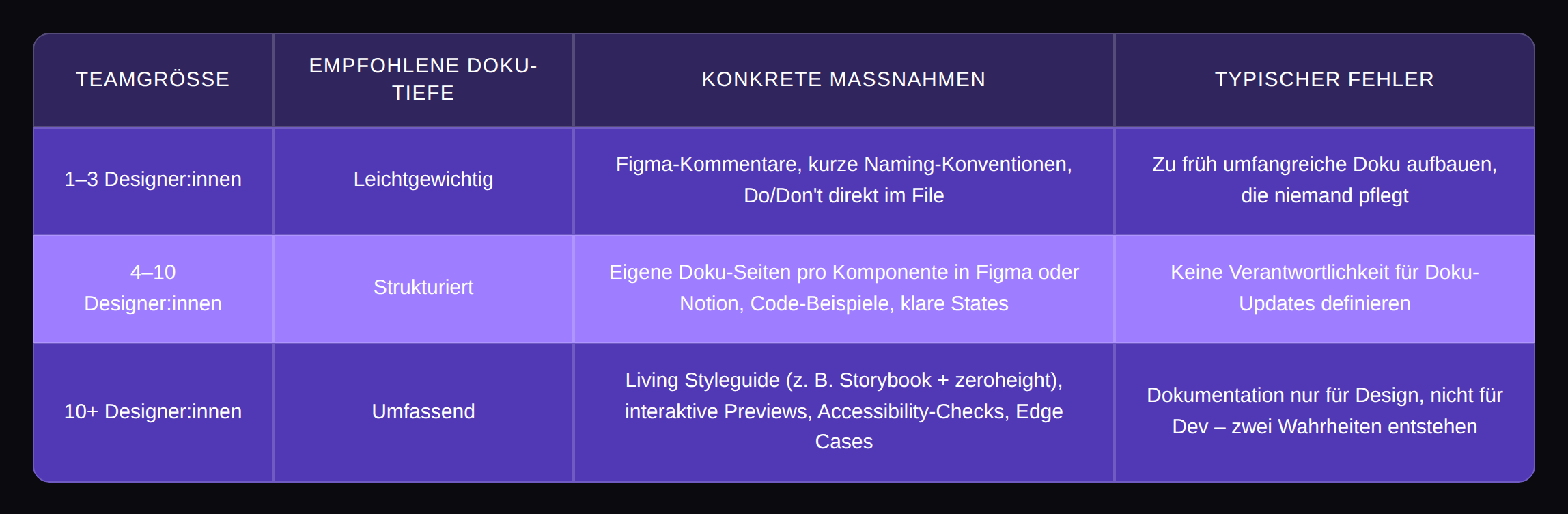
For a team of three designers, complete storybook integration is overkill. For a team of twenty, on the other hand, the lack of a living style guide is a real problem.
Content guidelines: language as a UX element
Design is also what you read. Language guides you through interfaces, explains functions, mitigates errors and builds trust. Good content guidelines define tonality, style, grammar and address. One particularly critical area is microcopy, which determines whether an interface is perceived as helpful or frustrating.
Figma Slots: What's Changing
Figma released Slots in open beta on March 5, 2026, and this feature deserves its own consideration because it addresses three fundamental problems that every design system team struggles with every day.
Problem 1: The Detach Drama. If a component cannot map the desired content, the instance is detached and no longer receives updates from the main component from that moment on. Detaching is not a user error! Rather, it is a workaround that shows where the tool reaches its limits.
Problem 2: The hide/show chaos. Many teams solve flexibility with hidden layers: dozens of variants of a modal with different combinations of visible and invisible elements. Slots simplify bloated design systems by reducing the number of necessary variants or hidden layers.
Problem 3: Component inflation. 20 variants of a modal that differ only in content, but each exist as a separate variant. This is the result when a tool does not distinguish between "shell stays the same" and "content varies".
Slots are a component property type - flexible areas that are placed in main components and allow content to be added and arranged directly in an instance without having to detach it. In Figma, they are visually marked in pink. The idea: The author of a component decides on the structure - frame, layout, spacing - and marks certain regions as open for the designers to work with.
Concrete use cases:
- Modal - A component for the basic modal structure (header, footer, close button), the content in the body is a slot. Instead of 20 modal variants, there is one - with any content.
- Task lists and FAQ lists - Components with repeating elements do not have to have a fixed number of occurrences. With slots, any number of elements can be added without detaching the instance.
- Cards and content pages - Basic components such as cards have numerous permutations. They need flexibility in layout and content types. With slots, elements can be resized, rearranged and different layer types can be inserted.
Slots already exist in code: React knows the concept as children props, Vue has a slot system with exactly this name. Figma thus closes a conceptual gap between design and code.
Important limitations: Slots is in open beta - changes, bugs and performance issues are to be expected. Component properties do not apply within Slots. Our recommendation: Only use component instances within Slots, no free elements. This way, the system remains controllable.
And a clear distinction: slots do not replace variants. They supplement them where the content varies but the shell remains constant. Variants remain the right tool for states (hover, active, disabled) or structural differences.
We have tested the beta. Click here for our Figma Slots Review.
The social dimension: Why design systems fail because of people
The biggest misunderstanding about design systems: The resistance comes from the developers. The truth is different.
"In my experience, the devs were never the problem. They were always very grateful."
Isabell, Senior Designer
The greatest friction arises between designers. Weeks of discussions about barely distinguishable shades of gray, fundamental debates about curves on buttons, endless loops without a decision. Simply because design is inherently subjective and no system is created without clear decision-making structures.
The ownership dilemma
When one person sees the design system as "their baby", something problematic happens: other teams are reluctant to suggest changes. Feedback is taken personally.
The solution: an active approval process instead of silent sovereignty. New components go through a review, decisions are documented and there is a clear authority that says at the end: This is the decision.
"You need a Head of Design who then says: This is it now and everyone will use it from now on."
Without this role, the system diverges because consensus among equal senior designers on aesthetic issues is difficult to achieve. Genuine decision-making authority is not an authoritarian concept, but a prerequisite for the design system to function at all.
The "not-my-topic" problem
Design systems do not only fragment through active resistance. It often happens insidiously: a colleague returns from parental leave and works past the usual workflow. New team members have no points of contact with the system. Someone "just" creates their own component because the search in the library takes too long.
Without a defined onboarding process for the design system, the erosion begins. Baby steps help: Migrate individual screens to the system instead of planning a big-bang rollout. Progress becomes visible in the end.
The greatest friction arises between designers. Weeks of discussions about barely distinguishable shades of gray, fundamental debates about rounding buttons, endless loops without a decision. Simply because design is inherently subjective and no system can be created without clear decision-making structures.
Governance: How a design system really works in the company
Governance sounds bureaucratic. In practice, it comes down to a simple question: who is allowed to change what, who decides, and how does the rest of the team find out about it?
Communication: the dual-channel approach
One insight from practice: documenting changes in Figma notes alone is not enough. Most teams overlook updates that are only stored in the design tool. What works: Maintain a parallel Slack channel in which every update is briefly communicated.
Design maintenance tickets as an operational tool
The integration of an existing product into a new design system rarely happens in one big swoop. What works: Design maintenance tickets as small, plannable tasks that flow into sprint planning. These can be argued to product owners with concrete benefits: fewer UI bugs, less coordination effort, faster feature implementation, etc.
Weekly dev exchange: the underestimated success factor
A fixed weekly appointment between the design system team and developers doesn't sound like much. The effect is enormous: clarifying specific questions about components, agreeing on naming together, resolving misunderstandings before implementation. If devs are involved in the naming and structure, they adopt the design 1:1.
Governance models in comparison
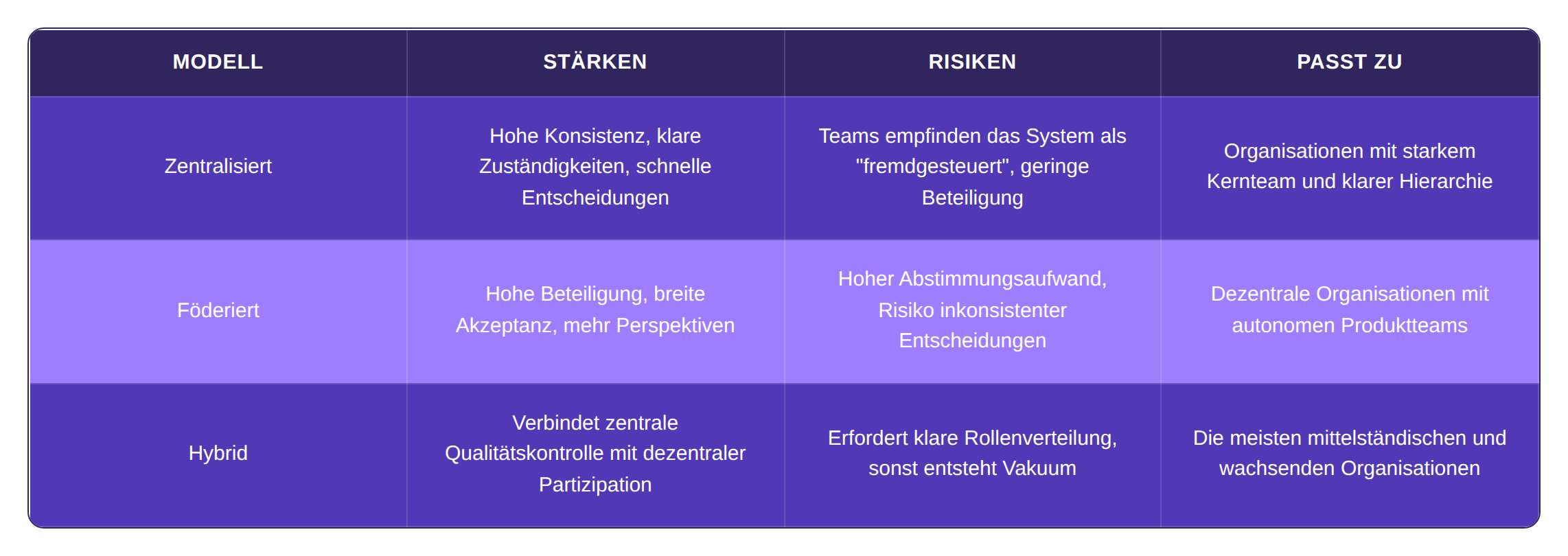
Teams want designers and developers to contribute across the organization, but maintaining quality and consistency requires governance. Most organizations have settled in the middle: Contributions are welcome, but are filtered through review processes. The challenge is to make this process lightweight enough to encourage participation without sacrificing standards.
Versioning and change management
Changes need structure. Semantic versioning (major, minor, patch) makes it immediately clear whether an update is compatible. Changelogs document what has changed. Review gates ensure that nothing unplanned gets into the system. Preview environments allow teams to test new versions before they go live. The aim is to make changes controllable and traceable, not to prevent them.
Tool landscape 2026 in practice check
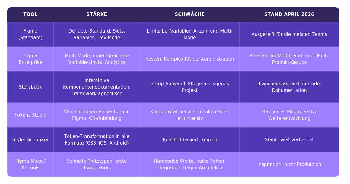
Figma is the de facto standard for design system work. Discussing this is a waste of time. The more exciting question is which features will really change everyday working life and where the hype will overtake reality.
Dev Mode makes some of the classic spacing documentation superfluous. Developers can see spacing directly. Nevertheless, a structured typography and token overview remains more helpful than clicking through individual elements in Dev Mode.
Figma Enterprise becomes a technical requirement above a certain level of complexity. Multi-mode setups with many variables, multi-brand requirements - all of this reaches its limits in the standard version. For most medium-sized teams, the standard version is sufficient for the time being.
Figma-to-code tools and AI codegen deserve an honest classification: as of April 2026, they are not production-ready for real products.
"It's actually another visual vibe coder: you prompt and then it writes the code. But it's not a design tool."
Jan, Sr. UX Writer
Tools like Lovable or other AI codegen solutions frustrate developers for good reason: hardcoded colors instead of tokens, wrong architecture, unmaintainable output. You should only ever treat AI-generated prototypes as inspiration, as they are no good as a handover document for development.
Tool overview as a table
Decision support and introduction: from zero to a functioning system
Does your company need a design system? The honest answer: it depends. And the following table will help you to assess this.
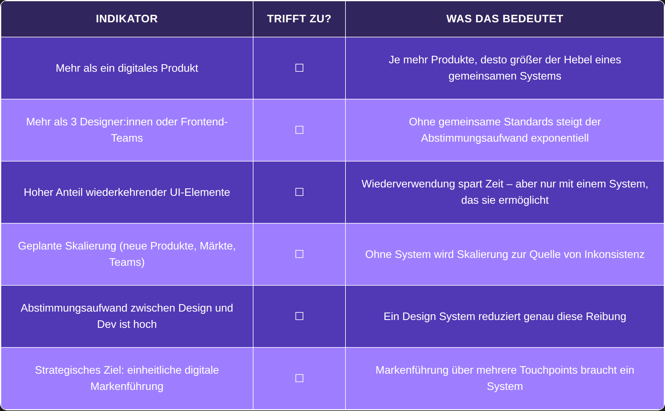
If three or more of these indicators apply, a design system is very likely to make sense. If only one or two apply, a well-maintained UI kit in Figma or central style documentation in Notion may suffice for now.
The number of organizations with dedicated design system teams increased again by 5% in 2026. This makes sense, as previous years have shown that a dedicated team correlates strongly with higher trust, higher adoption and higher team satisfaction.
Realistic timelines
Most guides fail to mention how long it really takes. Here is the honest version from practice:
- Basic version under pressure: approx. 4 weeks - the most important components, colors, typography, rudimentary tokens
- "Everything superficially coordinated": approx. 6 months - component library is ready, documentation exists, first teams are working with it
- Full penetration: Never-ending story. And that's okay. A design system is never finished, nor is the product it supports
Step by step: audit, MVP, rollout, maintenance
- Audit & inventory - Analyze which UI elements, styles and components already exist. Make inconsistencies visible. For systems taken over (e.g. from agencies), expect detached sketch migrations, undocumented color palettes and structures that have grown historically.
- Define MVP - Which components and tokens bring the greatest benefit? What is needed most frequently? Quality before quantity. An MVP is a motivating milestone, not a half-finished system.
- Rollout strategy - Involve pilot teams, carry out training, establish feedback loops. Adapt communication, training and enablement individually to the needs of the people who are to work with the system.
- Maintenance & further development - Define a maintenance roadmap (monthly or synchronized with product releases), create open feedback channels, mark unused components as deprecated and archive them.
Naming conventions: The underestimated success lever
An insight that is missing in most guides: one-to-one naming between design and code drastically reduces handover errors. If a component is called Card/Horizontal/Default in Figma, it should not be HorizontalInfoBox in the code.
Discuss your situation in person?
brightside Studio accompanies precisely this development work, from the first audit to the MVP to ongoing operation. If you want to evaluate whether and how a design system makes sense for your product, book a free consultation.
Fazit: Was ein Design System wirklich bringt
Ein Design System ist eine Infrastruktur-Initiative. Der Wert zeigt sich nicht am Tag des Launches, sondern in Monaten und Jahren konsequenter Pflege: weniger Abstimmungsschleifen, schnellere Feature-Releases, konsistentere Markenführung. Und in Developer:innen, die nicht mehr raten müssen, welches Grau gemeint ist.
Gartners Hype Cycle 2025 positioniert Design Systeme auf dem Weg vom "Peak of Inflated Expectations" in das "Trough of Disillusionment" – eine Phase, in der die anfängliche Begeisterung auf die harte Realität von Wartung, Adoption und organisationalem Buy-in trifft. Das heißt nicht, dass Design Systeme ihren Wert verlieren. Es heißt, dass die Phase vorbei ist, in der man ein System bauen und auf Selbstläufer hoffen konnte.
Fünf Empfehlungen für den Start:
- Ownership klären - Eine Person mit echter Entscheidungshoheit, nicht nur ein Committee aus gleichberechtigten Seniors.
- Klein anfangen - Die meistgenutzten Komponenten, klare Tokens, grundlegende Dokumentation. Qualität vor Umfang.
- Dev-Sync etablieren - Wöchentlicher Austausch mit dem Development-Team. Naming gemeinsam abstimmen, Fragen sofort klären.
- Baby Steps als Strategie akzeptieren - Einzelne Screens migrieren, Design Maintenance Tickets in die Sprint-Planung bringen. Fortschritt kommt über Konsistenz.
- Figma Slots jetzt kennenlernen - Das Feature verändert, wie Komponenten gebaut und gewartet werden. Wer früh damit arbeitet, spart sich spätere Migrationsschmerzen.
brightside Studio begleitet Unternehmen von der ersten Evaluierung bis zum laufenden System-Betrieb - mit einem Team aus Senior UX- und UI-Designer:innen, die genau diese Arbeit täglich machen. Wenn Sie herausfinden wollen, wo Ihr Produkt steht und was der richtige nächste Schritt ist,https://www.brightside-studio.de/kostenlose-beratung.