April 16, 2026
Updated on
Figma Slots: Guide and Expert Review (April 2026)
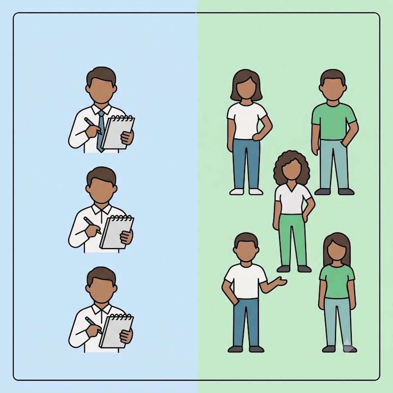
20 almost identical modals in one design system. All slightly different, none of them really necessary as a separate component. Anyone who works with Figma design systems knows this moment, including the quiet discomfort when the component library grows uncontrollably and nobody can say exactly why variant 14 exists.


Table of contents
This was the starting point for this article. We evaluated Figma Slots in the context of an ongoing complex project with its own design system. The goal? To see if slots can bring order to chaos.
Figma Slots went into open beta on March 5, 2026. They were announced on the Schema 2025 and have since been refined in close collaboration with customers based on real workflows. At the time of this writing, they are new enough that many designers have yet to try them out. And that's exactly why we go deeper here:
What are Figma Slots?
What problems do they solve?
How do you create them?
In addition, we show three concrete use cases from a real project, the most important rules for team use and, of course, an honest assessment of the current beta.
TL;DR: The most important things in a nutshell
- Figma slots are flexible areas in components. They allow content to be inserted, removed or rearranged in instances without detaching the instance.
- Three old workarounds become superfluous: detaching, hide/show and duplicating all had significant disadvantages for file size, consistency and maintenance.
- Slots are created in three steps: Create frame within a component, convert to slot (right-click, toolbar or Shift + Cmd + S), configure auto layout.
- Practical test with three use cases: Modals, chapter boxes and FAQ lists benefit directly from slots, with measurable reduction potential for variants.
- Slots do not replace variants. Variants remain relevant for states (open/closed, active/inactive); slots solve the problem of variable content in constant shells.
- Take beta status seriously. Stable enough for testing, but rollout only recommended after ongoing project handovers, then targeted cleanup of the design system.
Introduction
Imagine opening your design system and counting the modals. 20 of them. They all look almost the same. None is really superfluous, but none is really unique. That's exactly how it looked for us in one project; and that was also the trigger to seriously evaluate Figma Slots.
We want to share our practical experience (in addition to an explanation of what Figma Slots actually are): The Three Workarounds That Replace Slots. A step-by-step guide to creating them. Four concrete use cases from the current project. Rules for team deployment. And an honest classification of when slots are ready for production use.
The problem that slots solve
Before the advent of Figma slots, design teams faced a trilemma: How do you adapt components to different content without sacrificing the consistency of the design system or allowing the file size to grow uncontrollably?
Each of the three common workarounds solved one problem and created a new one.
Workaround 1: Detach. The quickest solution when an instance doesn't quite fit. Simply detach, make adjustments and continue working. The problem develops gradually: the detached component loses its connection to the design system. If the main component changes (new padding, different border radius or updated colors), the detached instance won't notice it.
Workaround 2: Hide/Show. The supposedly smarter solution: Pack all conceivable elements into the main component and simply hide invisible parts in the instances. Elegant in theory. In practice, a disaster.
"We once wanted to solve this by having everything in one and simply hiding things. In the end, we added more and more weight to our files because so much was hidden."
Invisible doesn't mean gone. The file size grows, the components become confusing and the system is hard to keep track of, especially for new team members.
Workaround 3: Duplicate. Create a separate component for each variation. Sounds like the cleanest approach at first, but leads to a design system that grows uncontrollably. 20 almost identical modal variants were the result in our case. Each one had its justification and yet none of them was really necessary as an independent component.
Here is a direct comparison of the three workarounds:
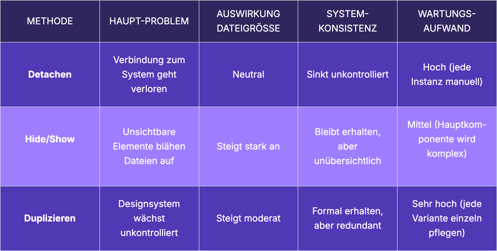
All three methods share a fundamental flaw: they try to solve a flexibility problem within a rigid system. This is where Figma Slots comes in.
What are Figma Slots?
Slots are flexible areas that are placed in main components and allow content to be added and arranged directly in an instance without detaching it, while maintaining the design system.
The core principle can be broken down simply: Within a component, you define an area (the slot) that serves as a container for variable content. Other components, texts or elements can be inserted, removed or rearranged there. The instance remains completely connected to the main component. Everything that should be fixed remains fixed: padding, borders, shadows, buttons. Only the slot area is open.
Slots vs. variants - the crucial distinction. Variants describe the state of a component: open or closed, active or inactive, expanded or collapsed. Slots describe what can be in a component. The distinction sounds subtle, but is huge in practice.
We agreed with each other in the test:
"The instances simply say the state of that one component. But when it comes to wanting flexibility in a component, such as in modals or entire sections... that's where slots actually become very helpful."
In Figma, slots are visually highlighted in pink. This is a deliberate design decision so that they immediately catch the eye in the layer panel and are not overlooked.
The concept behind slots has long been familiar to developers. Anyone coming from a development background has worked with this pattern throughout their career: Children props at React, Vue's slot system, Web Components' slot elements: developers have been putting interfaces together like this for years. The concept of a predefined area into which content is inserted is fundamental to the way the web works.
Slots is Figma's approach to the way developers actually work.
"Slot is simply the name Figma gave it. But the developers don't actually work in such a way that they have a component with things that they show and hide. We only have that in Figma."
The recommendation from our team: validate early on with your own developers whether the slot concept corresponds to their way of working. The chances are good that it does.
Creating Figma slots: Step-by-step guide
Slots only work within components. Each frame within a main component can be converted into a slot. Free frames outside of components are not possible. This is the first and most important requirement.
How to turn a frame into a slot:
- Create or open component: No slot without an existing component. If none exists yet, first define the desired structure as a component.
- Create frame within the component: This frame becomes the slot container. It defines the area in which variable content will later be inserted.
- Convert frame to slot: There are three equivalent ways to do this:
- Right toolbar: Click on "Convert to slot" (the small plus icon)
- Right-click on the frame: select "Convert to Slot" in the context menu
- Keyboard shortcut: ⌘ Command ⇧ Shift S (Mac) or ⌃ Control ⇧ Shift S (Windows)
- Right toolbar: Click on "Convert to slot" (the small plus icon)
- Optional: Enter description: e.g. "Text elements only" or "Text elements only".E.g. "Text elements only" or "Checkbox, Radio Button, Input Field". Sounds like a small thing, but is worth its weight in gold in larger teams.
- Optional: Define Preferred Instances: Components that should be suggested as the default selection when someone fills the slot.
Auto Layout remains the silent prerequisite: Without a correctly configured Auto Layout, inserted elements do not behave as expected. Before slots are used productively, the Auto Layout setup of the component must be clean. Otherwise, everything shifts and the wild search for errors begins.
Slot descriptions are team communication: In large design systems with many contributors, the description function is not a minor matter. By editing the slot property in the properties panel, you can customize the name, description and preferred instances.
We recommend: formatted text, links, even code snippets can be stored here.
"If you have a huge design system and work with a lot of people, you want to prevent questions. That's why you can write down all the rules here."
The more complete the description, the fewer queries.
Three real-world use cases
The following examples are from an ongoing project that our design team is actively working on. Each of these cases was a specific pain point that the team addressed with Figma Slots.
Modals: From 20 variants to one basic component
The initial situation: 20 modal variants in the design system. All with the same basic structure: Header, buttons, shadow, border, padding. The only difference was in the inner area, in the content. And yet each one existed as an independent component.
The solution with Figma Slots: A single basic component in which the header, buttons, shadow, border and padding are defined as fixed elements. The variable inner area becomes a slot. Different content can be inserted in each instance without changing the base.
"The padding is correct everywhere, the borders are correct everywhere, the shadows are correct and the buttons are in the right place. Only the content is variable."
A sentence that summarizes the entire promise of Slots. 20 variants become one component. Consistency increases, maintenance effort decreases.
Chapter boxes: Flexible task lists without hard-coded maximum
In the project, there are chapter boxes that contain tasks. Previously, we needed separate components for 3, 6 or any number of tasks per chapter. Every new requirement (e.g. a seventh task) meant: back to the design system, adapt the component, create a new variant, check everywhere to make sure nothing had shifted.
With slots: A box component with a fixed frame (chapter number, heading, description) and a slot for the tasks. Insert any number of task instances. No hard-coded maximum number. No separate components per number of tasks. The box grows with the content, not with the design system.
FAQ lists: Finally solving order problems
FAQ components come in three flavors: open, closed and list. Arranging and rearranging FAQ entries within an instance was a manual feat of strength.
"I went into the instance, added one there, went back - and then I noticed that Content had changed the order of the texts. I had to change the order everywhere. I lost so much time with actually three clicks by moving things up and down."
The slot solution: a wrapper component plus a slot for the FAQ entries. Add, remove, reorder - all within the instance, all without detaching.
Important to know: The free order in the slot can also produce inconsistencies. Clear team rules remain necessary.
Slots vs. variants: When to use which
"Do we need a variant or a slot here?"
The answer lies in the difference between state and content.
Variants describe states. An accordion is open or closed. A button is active or inactive. A checkbox is checked or unchecked. These are semantic differences that belong to the component itself.
Slots describe variable content within a constant shell. A modal always has the same frame, but the content changes. A FAQ list always has the same layout, but the number of entries varies. A content page always has the same structure, but the modules within it can be freely combined.
This distinction is particularly clear in atomic design. Atoms and molecules (buttons, input fields, checkboxes) remain independent components with variants.
"The whole molecules and atoms still exist - but when it comes to larger areas, like whole sections, slots become very helpful to have more flexibility."
Slots unfold their value at the level of organisms and sections. Where components are put together and the content becomes truly variable.
Both concepts complement each other. The question is never "slots or variants", but "where slots and where variants?".
4 rules for the sensible use of slots in a team
We have developed these rules based on our initial practical experience.
Rule 1: Not everything is a slot
Slots are suitable where the basic structure is constant and the content varies. A modal with a fixed frame and variable content? Slot
A button with different states? Variant.
The rule of thumb: If you want to fix the area in the main component (padding, border, shadow), use a slot for the rest. If the state of the entire component changes, stick with variants.
Rule 2: Only components in slots
Only existing components belong in slots: Input fields, checkboxes, radio buttons, text components. No free rectangles, no ungrouped texts, no loose elements
This is the only way to ensure that the design remains system-compliant. Allowing free elements in slots undermines the very consistency that slots are supposed to create.
Rule 3: Always fill slots
An empty slot will be overlooked. We recommend always providing slots with sample content or a visual label."
"In the presentation about slots, they somehow had a funny color in here and said 'fill me' or 'I'm a slot, put something in'... so that you don't miss that something is a slot."
A placeholder marked in pink with a clear label is much more helpful than an empty frame that nobody recognizes as a slot.
Rule 4: Write complete descriptions
Every slot needs a detailed description. What belongs in it? What should not be included? Which components are included? How many elements make sense? The description function in Figma supports formatted text, links and code snippets. The team uses it as central documentation directly at the point where it is needed
Bekannte Einschränkungen und offene Fragen
Figma Slots befinden sich aktuell in der offenen Beta. Änderungen, Bugs oder Performance-Probleme sind in dieser Phase zu erwarten.
Im Test unseres Teams lief das Feature stabil. Keine Abstürze, keine Datenverluste, keine gravierenden Darstellungsfehler. Aber das ist ein einzelnes Team mit einem einzelnen Projekt. Ein Produktionseinsatz über ein großes Design System hinweg birgt andere Risiken.
Elemente innerhalb eines Slots können in der Instanz frei umsortiert werden. Das ist gewollt, aber gleichzeitig gefährlich. Ohne klare Teamregeln kann jeder Designer die Reihenfolge ändern, was zu inkonsistenten Ergebnissen führt. Besonders bei FAQ-Listen oder Aufgabenlisten, wo die Reihenfolge eine inhaltliche Bedeutung hat, braucht es dokumentierte Konventionen.
Abgesehen davon waren wir uns einig: Slots nicht mitten in laufenden Projektübergaben einführen. Lieber zuerst laufende Projekte abschließen, dann eine gezielte Cleanup-Phase einplanen, in der das bestehende Design System auf Slot-Potenzial geprüft und umgebaut wird. Wer zu früh umstellt, riskiert Instabilität genau dort, wo Stabilität gebraucht wird.
Eine weitere Empfehlung: Interne Nutzungsregeln dokumentieren, bevor Slots teamweit ausgerollt werden. Die Flexibilität, die Slots bieten, braucht einen Rahmen. Sonst wird aus kontrollierter Freiheit unkontrolliertes Chaos.
Fazit: Ein Feature, das bleibt(?)
„Es ist irgendwie wie Auto Layout… das kam irgendwann und dann war es der Gamechanger. Ich glaube, hier wird das genauso. Oder auch Komponenten. Die kamen ja auch erst später."
Israas Einschätzung trifft den Kern. Figma Slots lösen ein Problem, das jedes wachsende Design System hat: die Spannung zwischen Konsistenz und Flexibilität. Slots repräsentieren einen fundamentalen philosophischen Wandel im Design-Tooling: weg von „Abweichung um jeden Preis verhindern" hin zu „Kreativität innerhalb klarer Grenzen ermöglichen".
Der konkrete nächste Schritt: ein Design System Audit.
Welche Komponenten werden am häufigsten detacht? Wo existieren fast identische Varianten nebeneinander? Wo bremst das Hide/Show-Muster die Dateigröße? Das sind die Stellen, an denen Slots heute schon den größten Unterschied machen. Figmas eigener Blog bestätigt:
„Start with components people detach the most"
Dort liefern Slots den größten unmittelbaren Nutzen. Early Adopters sahen die größten Erfolge dort, wo Teams bereits am Designsystem vorbeiarbeiteten: Dialoge, Menüs, Modale, Cards und Panels.
Sie wollen Ihr Design System mit Figma Slots optimieren oder sind sich nicht sicher, wo der beste Einstiegspunkt liegt? Wir bei brightside Studio hilft gerne.
Buchen Sie einfach eine kostenlose Beratung und wir finden gemeinsam heraus, welche Komponenten als Erstes von Slots profitieren.
Figma Slots
What are Figma slots and why do I need them?
Figma slots are flexible areas within major components that make it possible to add and arrange content directly within an instance without detailing it — while adhering to the design system. This makes three previous workarounds superfluous: Detach (loses the system connection), Hide/Show (bloats up files) and Duplicate (allows the system to grow uncontrollably). In short, slots give designers flexibility without sacrificing consistency.
Do Figma slots also work without an auto layout?
Technically, slots can be created without an auto layout, but the result will be problematic. Without a correctly configured Auto Layout, inserted elements do not behave as expected — they overlap, move, or ignore the intended space. Auto layout is the silent requirement that must be met before the first slot bet. If you want to use slots productively, you should set up the auto layout setup of the respective component cleanly beforehand.
What is the difference between slots and variants in Figma?
Variants describe the state of a component — open/closed, active/inactive, expanded/collapsed. Slots describe what content can be inserted into a component. In an atomic design context: Atoms and molecules (buttons, inputs, checkboxes) work with variants for their states. Organisms and sections (modals, cards, page layouts) benefit from slots for their variable content.
Can I already use slots productively or is the beta still too unstable?
Slots are currently in open beta - changes, bugs or performance issues are to be expected in this phase. In our practice, the feature ran stably, without crashes or data loss. The recommendation from the team: Introduce slots after ongoing project handovers, not during them. First plan a targeted cleanup phase, then gradually convert the existing design system to slots.
How many slots should a component have?
As many as necessary, as few as possible. The rule of thumb: Slots belong where the basic structure is constant and the content varies. A modal typically needs a slot (for the content area). A content page may need two (navigation and content modules). But: If everything in a component becomes a slot, the component loses its purpose as a consistent framework. “Of course, it doesn't make sense that everything is a slot” - this statement from the team is the best.