November 27, 2025
Updated on
Why targeted UX improvements are the effective alternative to a redesign
Many teams focus on the big change...and overlook the most effective UX levers.


Table of contents
When product teams talk about UX, the word "redesign" comes up surprisingly quickly.
No wonder, because (price aside) it sounds like a tempting solution in theory.
Just throw everything overboard, create a shiny new interface and all the problems are gone.
But in reality, a redesign is rarely the easiest way and not always the most effective way to achieve a better user experience.
In fact, quite the opposite: it is the most expensive solution, takes the longest and is often based on assumptions rather than insights.
The good news:
The greatest UX successes do not necessarily come from redesign. Because even small, targeted improvements exactly where your users get stuck at that very moment can work wonders.
Much faster, cheaper and yet noticeable and measurable miracles!
Why do redesigns look so attractive even though they overturn everything?
Imagine your bike no longer runs smoothly
Would you buy a new one straight away?
Although maybe it's just the tire that's flat?
Redesigns are the new bike.
Yes, sometimes it's necessary. But most of the time it is the wrong and expensive substitute for the testing, data-driven view.
And this is exactly why redesigns fail so often: they promise a lot long before it is clear what the problem is that they are supposed to solve.
New feels like progress
A fresh interface conveys the feeling of making a significant difference. Even if it was built completely without evidence. But even if it shines and sparkles: Users rarely leave a product because of the colors, but because of the stumbling blocks.
Redesigns start out complex
A complete makeover affects navigation, content, logic, technology and support.
Before figuring out what's really not working, the team is already in the middle of a major project. Was there a problem with the content in the first place?
Results come late
A redesign only delivers its value when everything is ready. Until then, it is difficult to collect reliable data. The result is a blind flight without an answer to the most important question.
Will it really be better? Or just different?
The biggest problems are not in the UI
In 90% of cases, a product doesn't fail because of the style, but because of:
- ...unclear forms
- ...misleading labels
- ...poor orientation
- ..too many decisions
- ...unnecessary steps
redesigns too often place an excessive focus on the look, where the problem was the feel from the start.
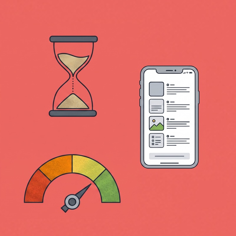
The alternative approach: small UX optimizations with a big ROI
Instead of throwing everything overboard at the same time, small optimizations target precisely those areas that frustrate users or even cause them to abandon the site. A redesign, so to speak, but only of the journey points that really need a redesign.
- Real user data as a basis: Interviews, support tickets, heatmaps or session recordings often show more than five months of discussions. A quick test quickly shows where friction arises.
- The biggest levers of the journey:Every user journey has critical moments. Mitigating these improves the entire UX without having to reinvent the UI.
- Effect within days instead of months: Small UX steps are implemented quickly and can be measured immediately. This is worth its weight in gold for teams that need to prove impact before releasing budget.
The five UX quick wins that almost always have an immediate impact
Improve microcopy
It sounds trivial, but often users fail because 2 words have been poorly chosen. We often see this because in many companies, UX copy is done on the side by the dev or content manager.
"It's clear what's meant here anyway."
The result: Buttons don't communicate clearly what happens when they are clicked. An internally completely logical label is completely incomprehensible to outsiders. Or an error message that generates questions rather than solving them.
You quickly realize that there is leverage here when users get stuck in supposedly simple places or support receives the same queries over and over again. At such moments, it becomes clear that the information on the page is not easy to understand. The great thing is that a clear text, a precise note or a helpful error message can be implemented in just a few minutes.
Remove superfluous steps in the flow
Many product flows have grown historically: one step was added, another was never questioned, a third is due to technical reasons. At some point, nobody asks themselves why a certain click exists at all...
... until you look at the analytics and see an unexpectedly high drop-off at precisely this point.
If users repeatedly abandon at the same point, this is often a clear indication that the flow is too long or unnecessarily complicated. And removing even a single step can noticeably speed up and simplify the process and increase conversion, especially in the checkout or onboarding, where every click saved counts.
Prioritize content clearly
A common pattern in overloaded interfaces: Everything is important. Everything should catch the eye. The result? Users can't see the wood for the trees.
The symptoms are clear: users spend a long time searching for relevant information, skip areas that they should actually read or ask questions about things that are right in front of them. Heatmaps that show that the gaze wanders wildly across the page are a further indication that the visual hierarchy is not leading the way.
Often, a small reorganization or a more conscious weighting of elements is enough to create orientation. This is because when what is relevant becomes visible, the cognitive load decreases, turning a cluttered page into a clear path to the goal.
Placing CTAs logically
CTA problems are rarely caused by the button itself, but rather by the context. No matter how well the CTA is designed, if it is in the wrong place, it will not be used. This can often be seen in usability tests or recordings when users falter when faced with decisions and simply don't know what to do next.
Heatmaps often reveal that central elements are not seen (see "Prioritize content clearly"). Users click everywhere, just not where the next action should take place. In such cases, it rarely helps to make the button larger; instead, it should be placed exactly where users would expect it to be. Because if the timing, position and message are right, the conversion increases all by itself.
Optimizing forms
Forms can be the biggest conversion killers. Many users start a form without completing it? A clear alarm signal. But it's often the little things: Too many mandatory fields, unnecessary detailed questions, lack of help
You can also recognize the need for optimization by the fact that users quickly scroll down to "estimate" how time-consuming the process will be - a clear stress indicator. Or the fact that error messages occur frequently that could actually be avoided. Just a deleted field, a smart hint or an automated lookup can make all the difference. Small UX interventions that make a big hurdle smaller.
Why small steps are the perfect proof of work
For CTOs, CPOs, product owners and founders, one simple truth applies:
Before UX gets a bigger budget, UX must first make an impact.
Sounds like a dilemma:
Without budget, no change.
Without change, no impact.
Without impact, no budget.
This vicious circle is exactly what you change with small, properly prioritized improvements. They don't require a major rebuild, a new roadmap or a complete overhaul of the design system.
Instead, they deliver quick, visible results that teams can prove in black and white.
Small steps also have an advantage at an organizational level: they are low-risk and rarely meet with resistance. Everyone understands that a clearer button text or a streamlined flow makes sense. Such changes don't just feel feasible, they are feasible.
The decisive factor, however, is their effect on the long-term decision-making basis: as soon as teams see that UX actually works, they are more willing to invest structurally.
Small optimizations create trust in the process and thus open the door for larger, strategic UX initiatives.
When a redesign makes sense
This article is not intended to cast a bad light on redesigns. They are absolutely justified! But in many companies, they are initiated too early or for the wrong reasons. There are clear situations in which a comprehensive redesign makes sense and is sometimes even necessary: for example, when:
- a new brand image is introduced,
- the product logic needs to be completely rethought,
- technical debt is slowing everything down,
- the existing structure is no longer scalable.
In such cases, a small UX update is not enough because the foundation has changed.
Never the less, a good redesign never begins with an immediate overhaul of the entire interface, but always with clarity about what is currently working and what is not. And it is precisely this diagnosis that is most reliably achieved through small, targeted UX steps before major design decisions are made.
We work with the UX Action Kit, which provides teams with precisely this clarity: Where does the existing system wear? Where is there friction? And which small changes would have the greatest immediate effect?
Find out more about the Action Kit