October 17, 2025
Updated on
The hidden costs of bad UX
Costs. When you hear that word, do you immediately think of office rent, personnel expenses, and budgets? If so, you are not alone.


Table of contents
Something that is far too rarely considered: poor performance of your products.
It doesn't appear in any budget line and is often not consciously perceived.
Nevertheless, it causes real costs. In the form of lost sales, additional support costs, productivity losses, and declining customer loyalty.
And what is often to blame?
A disappointing user experience.
The tricky thing is that poor UX is often the sum of small obstacles that seem invisible when viewed individually. These include a long registration process, unclear buttons at checkout, or a complex internal tool. Taken together, these are not minor issues, but rather a significant obstacle to growth. The effects are particularly strong in digital business models.
The good news is that many of these costs can be reduced with pragmatic, quick measures. And there is no need for lengthy redesign projects to achieve noticeable improvements.
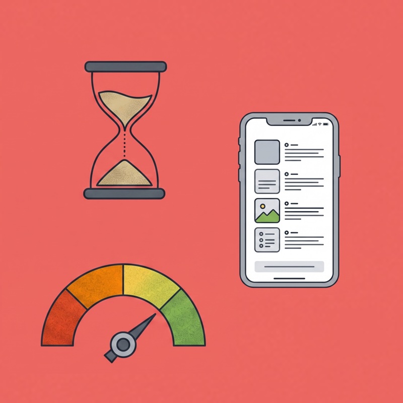
Typical symptoms of poor UX (and why they cost money)
Poor UX can take many forms, depending on the product...
...and it often manifests itself in situations that everyone is familiar with from everyday life. Imagine these scenarios:
The checkout marathon: A customer just wants to pay quickly. But then endless mandatory fields appear, half of which are incomprehensible. The result: abandoned shopping cart. Every abandonment means a direct loss of revenue, which adds up to significant sums over the course of a year.
Support as a permanent fire brigade: Your team answers the same question for the umpteenth time. Not because users are inattentive, but because the interface does not provide clear answers. Every inquiry costs time and money—resources that are lacking elsewhere.
The silent reputation killer: People don't rave about pretty buttons—they rave about smooth processes. If the experience is frustrating, there will be bad reviews and fewer recommendations. This makes acquiring new customers more expensive and jeopardizes customer loyalty.
The endless training loop: New employees need days to understand internal tools. Every hour of training time is lost working time. At the same time, motivation declines when processes are unnecessarily complicated.
The unused feature: Your team has spent a lot of time and effort developing a new module—and no one clicks on it. Not because it's irrelevant, but because it's hidden in the interface or implemented in a way that's difficult to understand.
The result: wasted development resources with no return. In short, symptoms of poor UX are not a minor issue—they are direct cost factors that impact revenue, efficiency, and brand perception.
Why these costs often remain invisible
If the consequences are so serious, why do they rarely appear in reports or budget plans?
The answer is simple: poor UX is well hidden
The costs are not incurred in one place, but are spread across marketing, support, development, and HR. No one sees the whole picture.
Abandoned checkouts or additional support hours are also rarely recorded as UX problems. Without a connection to metrics such as conversion rate, time-on-task, or NPS, they remain invisible.
And then there's the eternal misunderstanding of the “design issue”: many still see UX as a purely aesthetic detail. As long as this change in perspective is lacking and no one even considers poor UX as a reason for poor business performance, it can continue to be the inconspicuous leak in the balance sheet.
Quick levers for reducing UX costs
But: Behind every problem there is also a quick solution.
Instead of dry lists, here are a few scenarios showing how companies can initiate real improvements within a few days:
Observe users while they use the product: Five real users go through your product. After just a few hours, you'll see where they get stuck—insights that might otherwise never have come to light.
Evaluate support tickets: Instead of setting up new surveys, you can also look at your existing support tickets. Here you'll find your users' most common problems in black and white. Suddenly, the real everyday problems that consume resources on a daily basis become visible.
Keep an eye on time: Users complete typical tasks while you time them. Is a process taking significantly longer than you thought? Then you may have already discovered the next pain point that can lead to a quick win.
Check the microcopy: Small words have a big impact. Even clear button text or an easily understandable error message can reduce error rates, decrease support requests, and increase conversion rates. This is probably the best example that UX optimizations don't always have to be a mammoth project.
From cost factor to ROI lever
To make UX permanently visible in a company, it is not enough to simply identify the problems once.
Instead, they should be translated into measurable KPIs. Because numbers create clarity where opinions go round in circles. And with the right expertise, you can select and then interpret a suitable KPI for every context.
Classic KPIs for UX optimization:
Task Success Rate: How many users actually manage to complete a task successfully? The lower the TSR, the more urgent it is to revise the user journey.
Time-on-task: How long does it take users to complete a typical process? And could you make it even easier for them? Every second saved leads to more satisfied users.
Conversion rate: More revenue This directly shows how user-friendly a process is. A clearly guided flow prevents frustration, avoids dropouts, and thus increases the conversion rate.
Net Promoter Score (NPS): Whether users recommend your product to others is one of the strongest indicators of long-term growth. Poor UX pushes the NPS down, while good UX raises it. Keeping an eye on these metrics shows not just “beautiful design,” but hard business facts. And that's exactly what makes UX the lever that reduces costs and increases revenue. These measures are not an end in themselves. They deliver immediately actionable results – and show that UX pays off not after months, but within days.
Achieve measurable improvements in 2 weeks
You don't need big programs to see initial results. Even small, focused initiatives provide solid evidence of how UX contributes to key KPIs.
A two-week proof of work such as our UX Action Kit can be enough to:
- identify the biggest points of friction in the product
- implement initial quick wins that have an immediate impact
- demonstrate the business benefits with clear metrics.
The advantage: Teams gain confidence in UX without having to make a long-term commitment or allocate large budgets. Instead of abstract arguments, there is a tangible result on the table that shows: Better UX reduces costs and increases efficiency – faster than many expect.
Conclusion
Poor UX is not a marginal issue, but a business risk factor. It quietly eats away at resources, reduces satisfaction, and slows down growth—without immediately showing up in budgets.
The key point is that you don't have to wait until a comprehensive redesign project is set up. Even small, targeted measures can have an impact, reduce the burden, and demonstrate the added value for the business with clear metrics.
Companies that act early not only stop the cost leak, but also gain a solid foundation for establishing UX as a lever for growth.
Discover the UX Action Kit and reduce the hidden costs of poor UX in just two weeks.