July 2, 2026
Updated on
Built a product overnight with Vibecoding. Then hit a wall.
Why so many teams are currently ending up in the exact same spot, and why we find this development incredibly exciting.


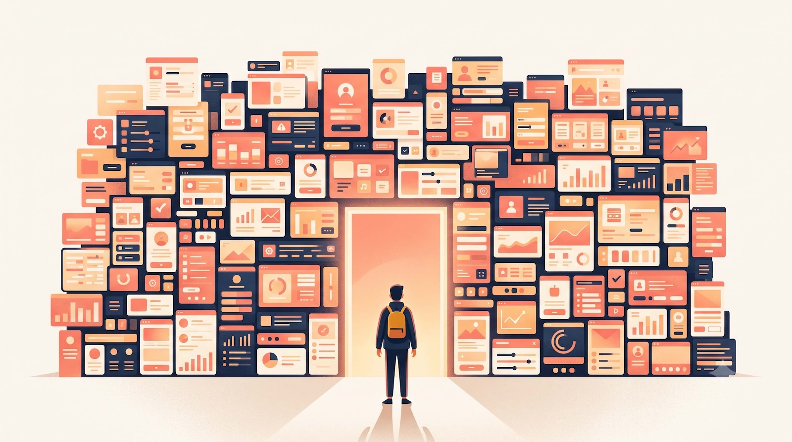
Table of contents
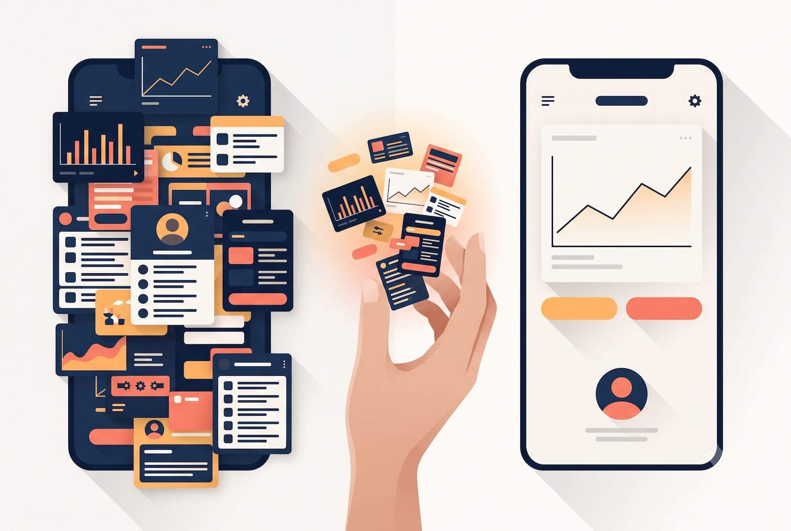
Lately, product development feels effortless. You have an idea for a new feature or an entirely new tool, you open your AI tool, describe what you envision, and a few hours later you're holding a clickable prototype. Real screens, real buttons, everything is clickable. It works. You've just created something without once waiting for the design or dev team.
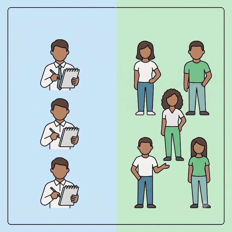
For us as a UX agency the clickable prototype was a key output not so long ago.
These days, it's increasingly becoming an input for our work.
We find this development incredibly exciting. What was unthinkable a few years ago is now commonplace: people without a design or coding background are bringing their ideas to the screen overnight. This changes how products are created, and it's great to see.
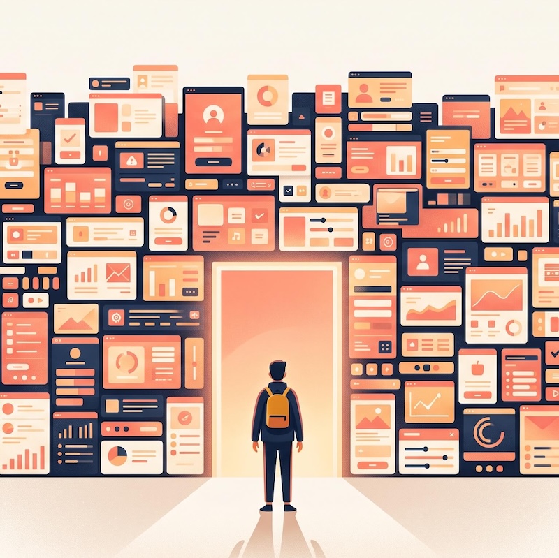
Then comes a second moment, which is at least as exciting. You click through your own creation and realize: it's quite a lot. Every screen is bursting with features, and you're no longer entirely sure what belongs where. You move features around, add something here, remove something there…
…but it doesn't really improve, it just changes. And eventually, you reach a point where the AI can no longer help you.
We're seeing this point more and more often. And it has surprisingly little to do with the specific industry, as we're seeing it with startups in very different fields. What's repeating is the point in the process where so many arrive at the same time.
The new pattern: build it yourself first, then hit a wall
The typical scenario looks like this: A team that already has one or more products on the market, with an in-house dev team and a functioning development process. What's often missing is dedicated UX capacity.
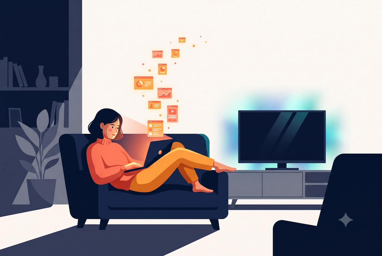
And then someone (often the founder and visionary themselves) has a new idea. Instead of putting it in the backlog and waiting for design capacity, they build it themselves. With an AI tool, quickly, perhaps in the evening on the weekend on the couch, with the TV running in the background. Not because the team couldn't do it, but because it feels really good: not losing time, not waiting for others, and having this feeling:
“I can actually do this myself!”
And that's exactly the energy we like. Someone who used to take weeks just to make an idea visible can now create something clickable overnight. This speed is a real asset, and Vibecoding opens up unimagined possibilities.
However, this high-flying start doesn't end with a finished product. But this isn't a dead end; rather, it's the beginning of the phase where things actually get really interesting.
Why AI pauses at this point
First off: The limit isn't a matter of "better prompting."
An AI is excellent at generating something new from scratch. That's precisely what makes it so valuable for the initial draft: quickly testing ideas, quickly having something clickable, quickly getting a feel for a direction. It becomes more challenging as soon as the new element needs to integrate into something existing. Because the AI doesn't know this context. It doesn't know the entire business background; it doesn't know the evolved ecosystem of apps, roles, and dependencies that already exist within the company. It builds in isolation because it can't do otherwise.
And that's why two things happen. Firstly, the prototype becomes bloated: The AI generously includes everything that sounds like "might be useful," and among all these features, it's hard to decide what truly belongs in the first iteration. Secondly, user guidance falls by the wayside. A clickable prototype is simply not a well-thought-out user experience. It requires a certain knack for guiding people cleanly step-by-step through a task without every screen overwhelming them.
Anyone who doesn't have this UX know-how in-house will feel it at this point at the latest. This isn't a criticism of Vibecoders, but simply the point where AI builders reach their limits and a bit of human experience makes all the difference.
The understandable desire for speed
What almost always accompanies this situation is the urge for speed. The prototype is ready, it works, it almost feels finished. So the next thought is obvious: The devs should start in two weeks.
We understand this reflex very well, and we even find it appealing. It's startup energy in its purest form:
Absolutely. No. Time. To. Lose.
We'd simply like to invite you to pause briefly at this point. When an extensive, isolated prototype moves directly into development, the unresolved questions go along with it... and addressing them later usually costs more time than was initially saved.
This isn't about slowing down the pace at all. It's about that one brief moment before you commit a direction to code, ensuring that the speed ultimately yields something truly viable.
The easily overlooked handover point
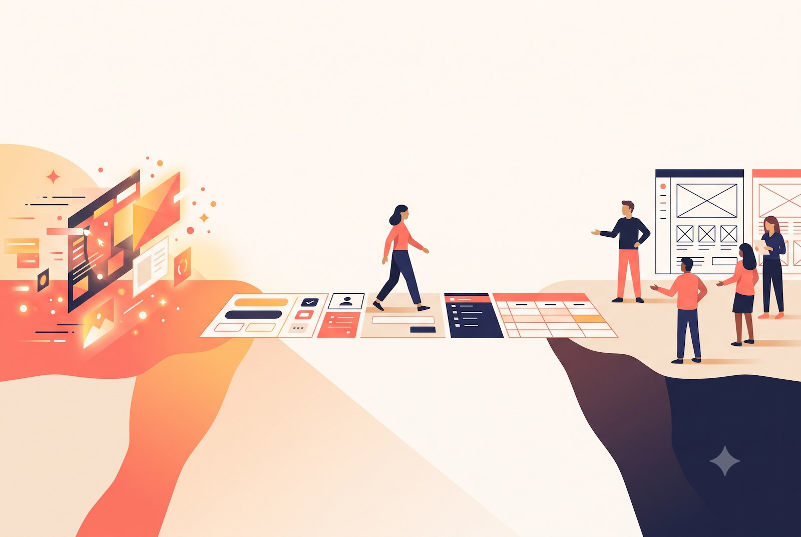
There's another very practical aspect that often gets overlooked in the excitement: the handover to development.
A clickable prototype from an AI tool isn't a foundation an engineering team can work with directly. While the generated code could theoretically be adopted, in practice, it's rarely suitable for that purpose. Developers need a proper foundation in the form of well-thought-out flows, defined components, edge cases, and clean files. Typically, they rely on Figma screens as their guide.
Precisely where all this excitement has led, a small gap emerges: On one side, there's something fast and clickable. On the other, there are developers who need something different to get started properly. The good news: for an experienced UX team, closing this gap is no big deal.
Human in the Loop: where we prefer to step in
The good news is: The prototype is far from wasted if you treat it as what it is: an impressive initial draft, but by no means the final product.
In these situations, we apply the "Human in the Loop" principle: After the AI has saved you significant time, we now take a deeper dive together and add precisely what's still missing at this stage.
Specifically, this involves a few steps. First, we examine what the AI has built and take a close look at the clickable result. Then, instead of dissecting everything at once, we identify the most critical flow. We then focus on this flow:
- Do we really need all these features on one screen?
- Is the visual hierarchy clear enough and does it help users find their way immediately – or does it still require a lot of brainpower to understand the interface?
- Where can we simplify because the real user group has completely different needs than the prototype assumes?
And that's exactly what we improve, with the UX knowledge that an AI doesn't possess, and with an eye for the context it cannot know.
The result is a better flow: user guidance that works for the people who will actually use the tool later, and that smoothly carries them from A to B. Sometimes this happens surprisingly quickly: working with existing screenshots, omitting things, quickly checking if the flow is right. It doesn't have to be a weeks-long project. But this one step, taking a look with the necessary expertise and full context, is often what brings everything together.
Consistency doesn't happen by itself
A closely related point: If a company already has a design system and established patterns, new developments should build upon them. This is also a minor weakness of today's AI tools. They are fantastic for something completely new. However, as soon as something needs to fit into an existing ecosystem, they tend to invent their own stuff, introducing inconsistencies that later need to be reined in.
Inconsistency almost always has the same cause, and it's surprisingly human: Too little is defined in the UX foundation. As soon as fundamentals are missing (what do edge cases look like? How does this one component behave? Where is the button?), everyone starts making their own decisions: founders, product managers, developers. Everyone adjusts a little here, adds a little there. And in the end, the design and the finished product diverge, without anyone being "to blame". Reusing existing elements instead of constantly creating new ones sounds trivial, but it's one of the most underestimated levers for quality.
And: simply test it
One final suggestion, which almost sounds too obvious to mention: Before development begins, it's worth testing with real users. This doesn't have to be large-scale or elaborate. The practical aspect is even obvious, because the clickable prototype already exists. You can take it, do a quick loop, and find out if the user guidance holds up before it's cast into code.
What it's really about
What this is about is not a specific industry, nor a specific tool. It's about a point in the process where a striking number of teams are currently arriving simultaneously. They are building something with AI that feels fantastic – fast, clickable, entirely on their own. And then they hit the limits of what an AI can achieve without context, without UX depth, and without an understanding of the evolved ecosystem.
This is not a setback, and the answer is not to throw everything away and start from scratch. But it's also not to push through at all costs. It is, at precisely the right moment, to bring in a person with the appropriate expertise: to review it together, simplify the crucial flow, and hand over the result in a way that allows development to proceed smoothly.
If you're currently facing this challenge: Contact us so we can break through it together.