
Moaky · Health & Care · Marketplace
From a makeshift proof of concept to a pitch-ready care marketplace in under 4 weeks
Moaky set out to connect families with open places in care facilities. Together with the founder, we rebuilt the concept from the ground up. Six months later, a competitor acquired Moaky before it had even launched.
- Client
- Moaky, marketplace for care places
- Stage
- Proof of concept, bootstrapped
- Duration
- Under 4 weeks, spring 2025
- Budget
- Under €10,000
- Services
- Team
- 2 UX strategists + founder
- Status
- Pre-launch exit, autumn 2025
Starting point
Finding a care place with pen and paper
When a family member suddenly joins the roughly 6 million people in Germany who need care, things often have to move fast. Depending on the situation, families need a home care service, fixed days at a day care centre or a permanent place.
Care facilities still manage most enquiries and appointments on paper. Nothing is recorded in one place, and a lot gets lost.
The Moaky team started by visiting care facilities in person and asking: How does your system work today? What works well, and what doesn't?
An external developer then built a first proof of concept. It worked, but it was hard-coded and difficult to extend. Feedback from the facilities stayed vague, because the concept was too abstract to compare with their own day-to-day work. Moaky needed something solid to win over investors.
The problem
A marketplace with only one side
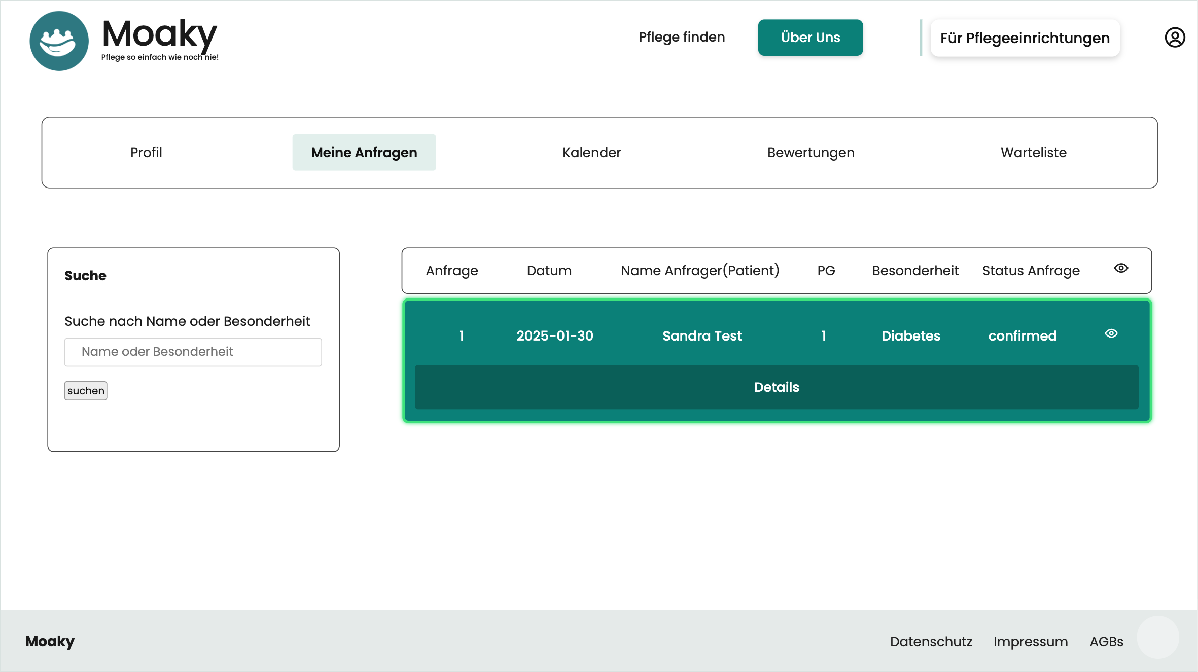
The UX audit showed where things were stuck: the Moaky team had built the platform almost entirely from the perspective of the people searching. Care facilities barely featured, even though that is where most of the requirements and technical questions sit.
For a marketplace, that is a fundamental problem. An elegant search is no use if the facility at the other end can't handle the enquiry properly.
User group 1
Families looking for a place
Well thought out in the proof of concept: send an enquiry, see its status. Usually it's a daughter, a son or a carer searching on behalf of the person who needs care.
User group 2
Care facilities allocating places
Barely integrated in the proof of concept, even though this is where most of the requirements are: prioritising enquiries, scheduling appointments, connecting to existing systems.
Further findings
- Every new idea turned into a construction site. The proof of concept had been built without well-defined flows, so for features like prioritising enquiries it was unclear where they belonged.
- The Moaky team knew what the facilities needed. What that looks like as a workflow in everyday practice was still open. The audit surfaced many steps the team hadn't thought of yet.
The key insight from the UX audit
The Moaky team knew its users very well.
What was missing was the step from insight to product.
That is exactly where our approach comes in.
Our approach
Zoom out first, then focus
Before designing any screens, we took a step back with the Moaky team and their developer. Then we focused on the minimum Moaky needed to pitch convincingly. This follows the principles of Lean UX.
01
Discovery Workshop
Agreeing together on how we measure success, and checking which resources are really available.
More on the Discovery Workshop02
User Journey Mapping
We turned what Moaky had learned in the facilities into journeys for both user groups. Insight: the person searching is usually a family member.
More on Journey Mapping03
Two core flows, fully thought through
One flow for families and one for facilities, both built as clickable prototypes.
More on Prototyping
The solution for facilities
Morning at the care facility
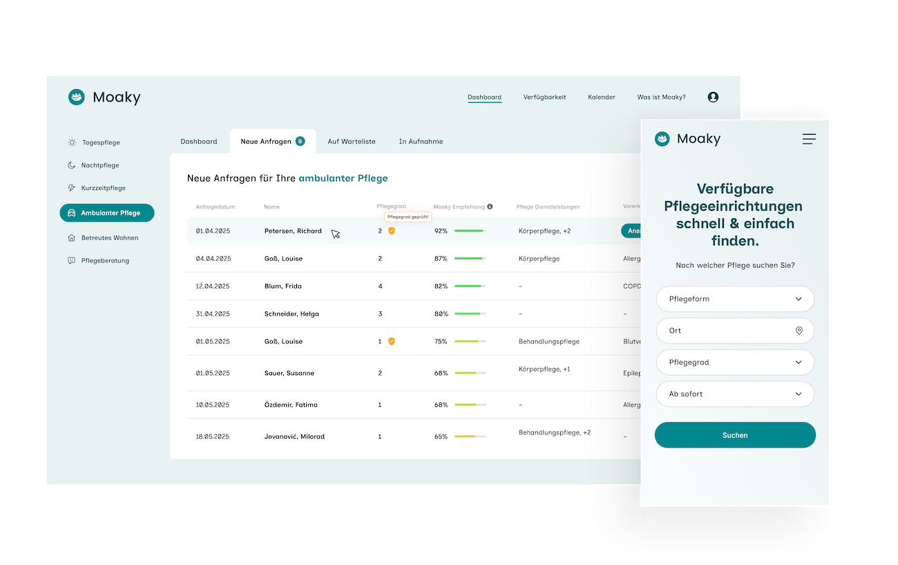
We started with an everyday scenario: someone at the facility switches on the computer in the morning and finds three new enquiries. Which one do they handle first, and how do they organise the appointments?

- 1
Organised by type of care
Each type of care has its own processes and therefore needs its own area.
- 2
Clear status
Every enquiry moves through New, Waiting list and Admission.
- 3
Moaky recommendation
The conversations Moaky had on site showed that facilities struggle with allocating places, so we designed a feature for it.
- 4
“Care level verified”
A badge shows whether the care level has been documented.
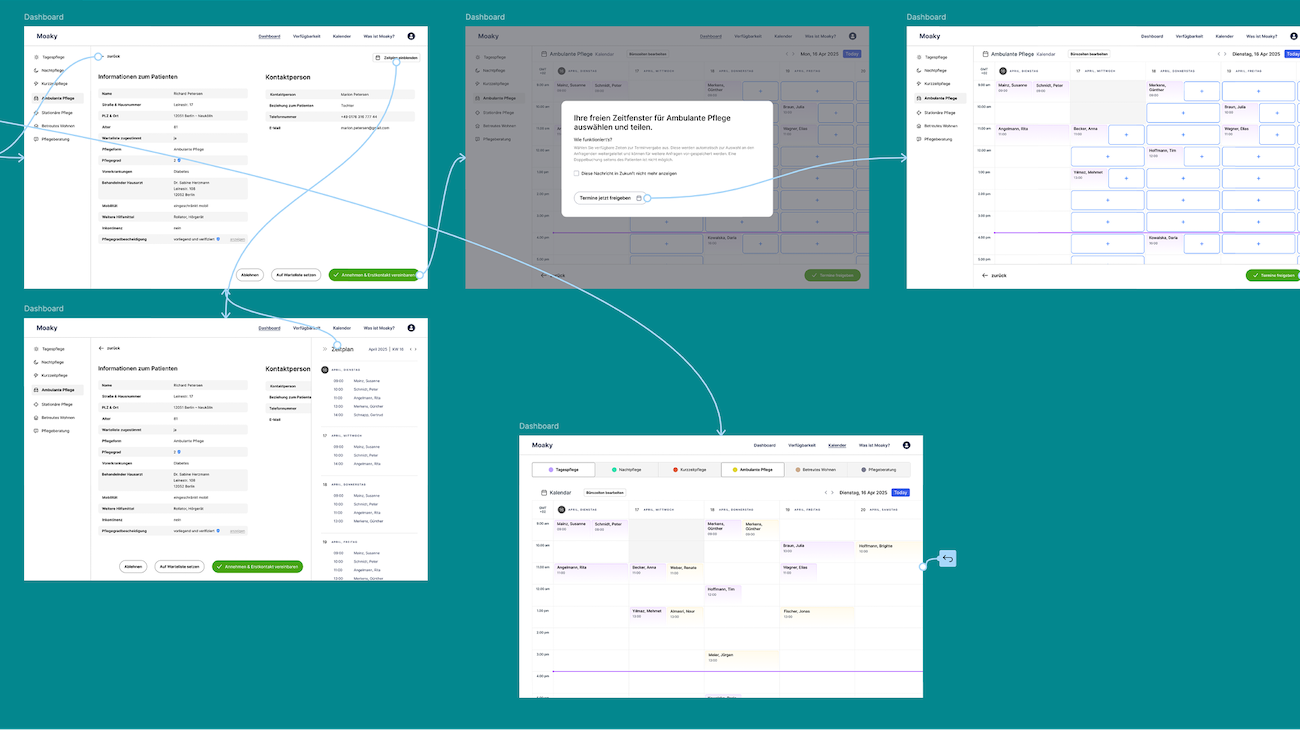
Accept, share time slots, book it in the calendar
The facility accepts suitable enquiries with one click and proposes a first meeting straight away. To do this, it releases free time slots from its calendar, which then appear automatically on matching enquiries. Double bookings are ruled out.
For staff, that means no more paper chaos and no more chasing people by phone. For every enquiry it's clear which step it's at. That takes pressure out of a working day in which a family is waiting behind every enquiry.
The solution for families
Search, find, get an appointment
Families often need to find a place quickly. That's why the search asks for just four things: type of care, location, care level and start date.
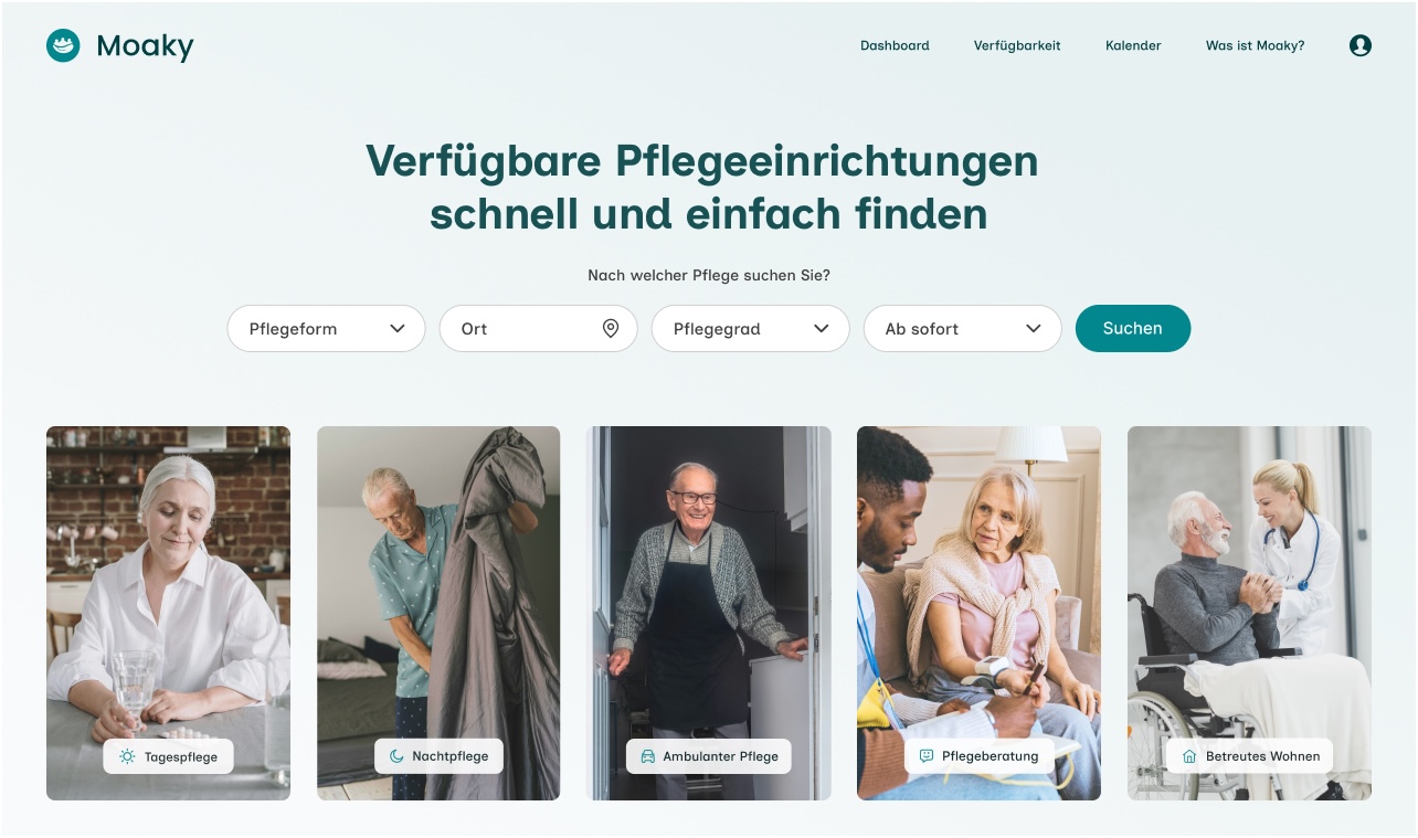

One tile per type of care
Each type of care has its own tile with an image.
Designed for families
The search is aimed at adult children and carers looking for a place for their parents.
Straight to an appointment
Families pick an appointment from the time slots that facilities have released.
Before / After
What changed in the logic
 VorherNachher
Prioritisation at a glance
Before: a list of enquiries with a status. After: facilities see straight away which enquiry is a good fit and whether the care level is documented.
Structured by type of care
Before: one view for every case. After: separate areas, because each type of care has its own processes.
Appointments from the calendar
Before: appointment suggestions as text. After: appointments from released time slots, right in the facility's calendar.
Result
Two prototypes Moaky could pitch with
In the end, Moaky had two clickable prototypes and a revised concept. The team planned to use them to keep testing with care facilities and to win investors. About six months after the project ended, a competitor acquired Moaky, before its public launch.
- from audit to finished prototype
- < 4 weeks
- fully thought-through logic
- 2 core flows
- total budget
- < €10,000
- sold to a competitor after 6 months
- Successful exit
Client voice
What the founder says
“Working with brightside Studio gave us the clarity and momentum we needed. Their ability to challenge our assumptions while offering practical, well-considered solutions helped us turn a concept into a tangible, testable product.”

Chantelle Davis
Founder, Moaky
What founders can learn from Moaky
Every project is different, and yet some lessons carry over to other products.

